jesse-whyte.net
11-Oct-2013, 3:59amThis website was developed over a semester of advanced web design at QUT.
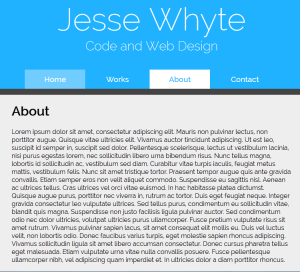
It was inspired by minimalist folio websites featuring very few, but bright colours, and a strong theme.
The header was one of the few constants over the course of this design. I knew I wanted to state right out of the gate what this website was about, and the header achieves that effectively.
I also knew I wanted my content in a central column layout, and that was the next thing to go in. I spent a lot of time playing around with font size and column width to get the design looking the way I wanted it.
In the initial stages of design, I wanted a twitter feed on every page of the site, but quickly decided that one page was enough, and limited it to the home page.
As for the twitter feed itself, I tried a lot of plugins before deciding on a simple search-based plugin and using a jquery script and css to turn it into a marquee.
